Branding in Small Towns: Adapting Visual Identity to a Local Audience
Branding strategies that work in big cities often fall short when applied in smaller towns. The values, perceptions, and engagement methods of a local community differ drastically from urban audiences. To build trust and resonance, businesses and initiatives in small towns must localise their visual identity with purpose and nuance.
Understanding the Local Context
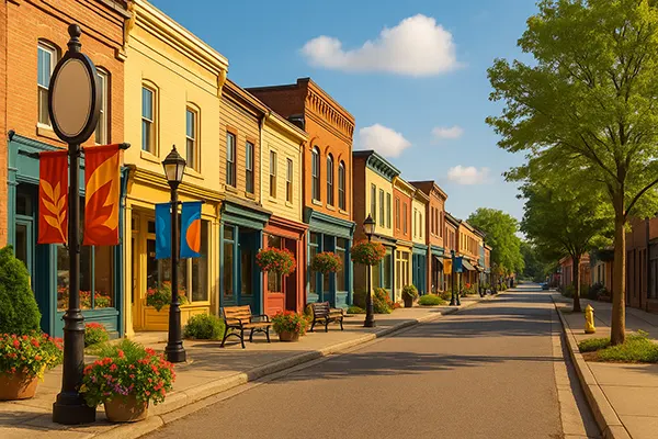
Every small town has its own social fabric, history, and identity. Whether shaped by agricultural traditions, mining history, or a strong sense of community, these elements become key drivers in shaping how branding is perceived. Local colours, landmarks, and dialectal language often hold emotional significance that mass-market branding fails to replicate.
Branding should begin with listening. Focus groups, informal interviews, and social media feedback can reveal deep insights into what the community values. Often, it’s not about flashy logos or cutting-edge design but rather authenticity and relevance to daily life.
Moreover, demographic factors matter. In a town with an older population, readability and familiarity in typography and symbols are vital. In areas with a younger or mixed demographic, bolder, digital-friendly visuals may have more appeal. The adaptation must be data-informed but also sensitive to intangible cultural elements.
Engaging Local Culture Through Design
To create visual materials that resonate, designers must incorporate local symbols meaningfully. This may include referencing historic motifs, architecture, or even community legends. The aim is not to aestheticise the past but to build continuity with it. For example, using colours from a town’s flag or shapes from its most recognisable buildings can generate an immediate connection.
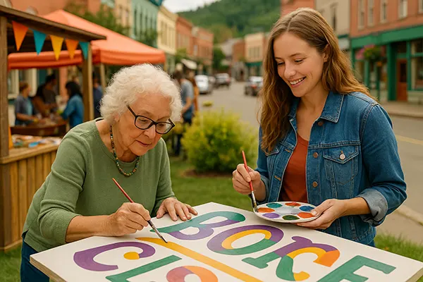
Photography also plays a central role. Stock images are often out of place in small-town contexts. Instead, showcasing real people, local streets, and recognisable everyday moments enhances relatability. Where possible, engage local photographers and artists to co-create visuals. This approach reinforces authenticity and gives the audience a sense of ownership.
Importantly, minimalism should not mean blandness. Simplicity in design helps with recognition but should be guided by local relevance, not abstract modernism. Strong branding in small towns often blends traditional aesthetics with contemporary clarity.
Building Trust Through Familiarity
In small towns, reputation travels quickly. A new visual identity will be scrutinised not just for its appearance but for what it represents. Thus, consistency in usage across printed materials, signage, and digital channels is essential. It signals professionalism and dedication—values that small communities deeply respect.
Fonts and colour schemes should evoke trust. Warm, earthy tones often work better than stark, high-contrast palettes. Serif fonts, though seen as old-fashioned in urban contexts, can evoke heritage and reliability in rural settings. The tone must suit the context without feeling outdated.
Frequent visual inconsistencies or tone-deaf designs can erode credibility fast. To maintain trust, ensure that every design piece aligns with core values of the town. This includes maintaining local language norms—such as formal vs informal speech—and reflecting familiar customs in event posters, social ads, and leaflets.
Involving the Community in Visual Identity
One of the most effective strategies is to involve the community directly in branding processes. Public polls to select logos or colours, collaborative mural projects, and workshops with schools or local artists bring the brand closer to its audience. It also fosters a sense of shared ownership that can’t be manufactured by external consultants alone.
For example, schools can run contests to design mascots or symbols. Youth centres might help produce promotional videos or social content. Local businesses may adopt unified window stickers, reinforcing a town-wide branding initiative.
This collective involvement builds more than recognition—it builds pride. A visual identity created with and by the people is far more likely to be supported and maintained. It also helps branding evolve with the community rather than becoming static or obsolete.
Long-Term Adaptability and Relevance
While the core brand identity must remain consistent, adaptation is key to staying relevant. Seasonal campaigns, local celebrations, and unexpected events call for dynamic content. Templates for posters or digital assets should allow flexibility while staying recognisably part of the core brand.
Moreover, data should guide changes over time. Which posters got more attention? What social media visuals drove higher engagement? Monitor feedback loops and adjust. Small towns may resist change initially, but if shifts are gradual and well-communicated, they are often welcomed—especially when tied to real needs.
Finally, don’t forget legacy. When updating branding, maintain a visual link to the past. A rebrand should feel like growth, not abandonment. Honour previous colours, patterns, or layouts where possible. People’s emotional investment in visual memory should never be dismissed.
Balancing Digital and Offline Channels
In small towns, offline communication still plays a dominant role. Bulletin boards, notice sheets, and flyers are part of daily life. Branding efforts must extend here as much as they do on Instagram or Facebook. Visual cohesion between online and offline materials ensures wider recognition and easier community connection.
However, digital channels shouldn’t be neglected. Many residents, especially younger ones, rely on social media for event updates and local news. Use branded templates and consistent typography across stories, posts, and event invites. Keep image sizes optimised for mobile consumption.
Consider QR codes on physical materials linking to digital experiences, such as videos, surveys, or additional content. Bridging the physical and digital reinforces branding while improving access and engagement across all generations in the town.
Best News
-
 SMM Automation: Chatbots, Messaging Tools ...
Social media management in 2025 is increasingly shaped by automation technologies that support communication speed, service …
-
 Vibe Marketing: Creating Campaigns Driven ...
Modern marketing is no longer defined solely by data-driven decisions. While statistics and analytics remain vital, …
-
 How to create a successful brand?
Brand success is an important indicator. Thanks to it, you can stand out from the competition …
-
 What is copywriting?
Copywriting is now one of the stable sources of additional or permanent income. However, not everyone …
-
 What is marketing?
Now more and more people get information from the Internet. Newspapers and televisions have been replaced …
-
 How to choose a logo?
The logo is an important symbol of any brand. It is designed to make the company …